Defining Design System Principles
An iterative set of 8 standards for building and maintaining effective design systems.
Last updated: Mon May 11 2026

What is a good design system? Depending on who you ask, it can mean different things. Good for who? In what way is it good? How do I measure its goodness? I think this is normally where someone peeks in and yells: “You need values!”. But here’s the thing: I never found it helpful to refer to a set of broad or obvious buzz words like “Simple, Valuable, and Clear”.
Turns out what I really needed was a set of principles. In my experience, companies interchange the terms principles, standards, and values so allow me to elaborate on how I have come to use them.

My reaction when a company value is Valuable
What are Values?
Values are qualities that drive principles. They are the small carefully chosen subset of intentionally broad (bordering on obvious) adjectives that serve as a mechanism to inform principles. They describe how a product should feel when using it. Values are helpful, but in my opinion, not on their own.
What are Principles?
Principles are the practical, stern, opinionated standards that guide decision making. They reinforce the core values and help decisions move in a consistent direction.
I’ve been curating my personal values (and principles) over the years to be more conscious of what I value when maintaining a design system. I didn’t even call them “principles” until recently. They were always just my “opinions” that I didn’t write down.
For me, they apply to component creation, governance, maintenance, and being a supportive design systems teammate. They aren’t written in stone. They are a baseline for me to measure against so I can be deliberate about change as I mature in my role.
If I’m honest, they shift monthly (just like a design system). Some weeks I’m a hammer of righteous indignation, some weeks I’m Mother Teresa.
My Values
- Simple
- Intuitive
- Composable
- Inclusive
My Principles
1. Tools over rules
Think of the system as a toolbox, not an instruction manual. Support the community, don’t govern them. Design systems are about supporting others with tools and information to improve upon what has already been built — not police against it.
For me, this could be the only principle on this page as it underpins everything else. Design systems are massively subjective, but they have a tendency to position themselves as the "right" or "best" way to do something. It took me many years to realize, aside from accessibility considerations, there often isn't a "right" or "best" way. It's always a collection of decisions that are the byproduct of prioritizing certain values over others over time.
I should say, this principle is not a free pass to do whatever you want. It’s a reminder that the system should be a tool to help others make decisions, not a rulebook to police everyone against them. It’s a subtle but important distinction that I think is often overlooked in the design systems community.
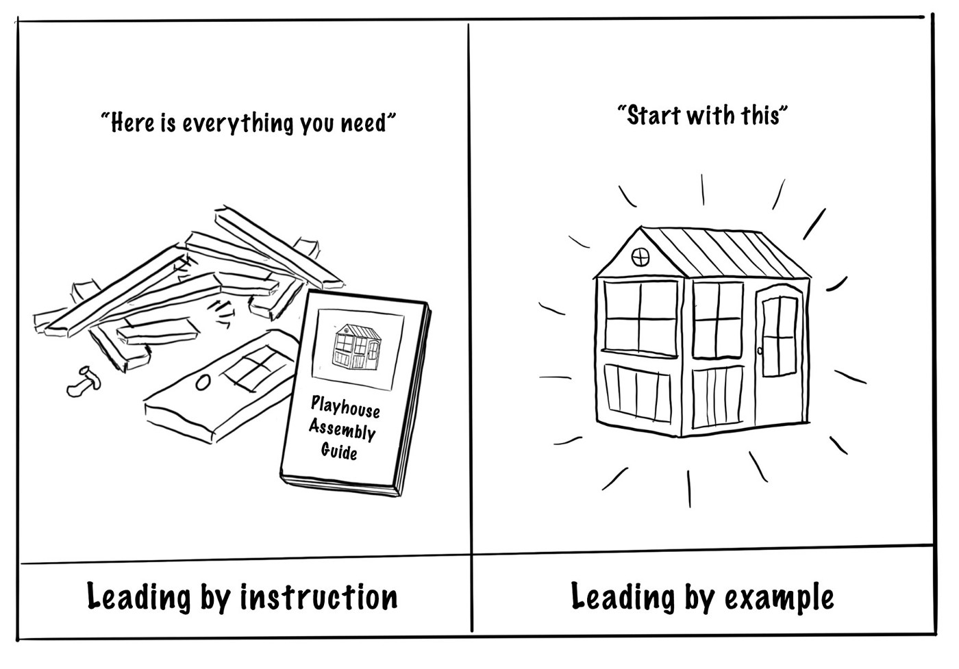
2. Lead by example, not by explanation
Show best practices with real examples, not instructions on how to recreate them. Writing an instruction manual on design patterns is laborious to write and read. It’s significantly easier to adopt, understand, update, maintain and implement from live examples.
Also, a system can’t, and shouldn’t, try to predict every situation a component will be used in with documentation. In my experience, trying to document every scenario ends up creating a laundry list of exceptions.
For example: Buttons always lead with a verb… except for common actions like “Done”, “Cancel” or “OK” … but OK is only permitted in mobile applications… and this doesn’t apply to Button Groups… and not when button length might cause problems in compact UIs.
3. The goal is cohesion, not consistency
There are a lot of goals of a design system: consistency, usability, coherence, developer experience, designer experience, accessibility, efficiency… the list goes on. The point of this principle is to remember the primary driver for a design system is not to enforce consistency.
Consistency is the automatic result of a system that is a joy to use. When the system is intuitive and composable, consistency becomes an automatic by-product of adoption. Sure, consistency is a key consideration but when it’s the main priority of the system it becomes a self-governing restriction that causes stagnation.
Let me phrase this a different way: if the primary goal of your design system is consistency, then fundamentally the first reaction to any change will be "no" on the basis that it's different. That has always felt like an unapproachable and uninspiring way to create to me. Consistency is important, and unneccessary inconsistency is a problem, but if all you have is a hammer, everything looks like a nail.
4. Remove what’s not absolutely necessary and perfect what remains
It’s very easy to add. It’s almost impossible to remove. Every addition should fight to be included. This is a difficult line to draw but complexities that creep into the foundation of a design system propagate out and become much harder to amend if users get accustomed to it.
5. Think inclusively
Accessibility is an integrated part of design system development, not a box to check at the end. Inclusivity is imperative for building successful, ethical products that scale. Not to mention, accessibility is hard and design systems are in the unique position to champion it as a fundamental standard for design, development and content strategy.
6. Design systems speak in tokens
How a system defines, references, talks about, and curates its design tokens (of all tiers) is very important. They are the soul of your system’s aesthetic, the most fundamental visual building block, and the glue that holds the system together in a way no other part can. It’s also frequently the code most likely to be leveraged across code bases.
For instance, a color is very rarely only a “color” when in a design system. It’s much more likely an abstracted token like “primary-color” or “text-color”. Thinking this way helps abstract the visual aesthetic away from the raw values to how design attributes get applied to the context of the entire system. This is particularly helpful (a requirement, really) when designing with themes in mind.
7. Trust your designers and engineers
This is more of a north star than a principle but I find it to be a particularly useful periodic gut check: the system succeeds when it can be used independent of its creators. That is to say, the system should equip others with the principles, knowledge, and tools to solve problems without the design systems team.
I think about this principle a lot like the proverb “Give a person a fish and you feed them for a day; teach a person to fish and you feed them for a lifetime.” I find it to be a much more rewarding experience when the system strives to inspire the approach to solving problems vs being the prescriptive guide of previous solutions to them.
The other aspect of this principle bleeds into #8. I find if you stop trusting your designers and engineers to use the components accessibly and effectively it results in tightening your grip on the composability in an attempt to ensure it. This may seem positive at first, but over the long term, it promotes a restrictive mentality that ultimately has diminishing return as users break apart and/or sidestep the system entirely in pursuit of more freedom.
8. Composability over control
This principle is a work in progress for me cause it’s not an easy one to follow from a practical standpoint.
Composabilityy is important but too much and it starts to feel like a puzzle. Too little and it doesn’t leave enough room to flex. Finding the sweet spot is difficult and in my experience, largely subjective.
Take the below example. Each variation produces a button with an icon. There are objective pros and cons for each approach but at the end of the day the chosen execution is based on preference.
JSX1// What is the best balance between simplicity and modularity? 2 3// Configuration via properties 4<Button startIcon={Icon} label="Label" /> 5 6// Configuration via children and properties 7<Button startIcon={Icon}>Label</Button> 8 9// Configuration via children and other components 10<Button> 11 <Icon/> 12 Label 13</Button> 14 15// Configuration via subcomponents 16<Button> 17 <Button.StartIcon> 18 <Icon/> 19 </Button.StartIcon> 20 Label 21</Button> 22
This topic is incredibly interesting to me. I think it could be several blog posts just by itself. Defining the appropriate level of customization is where design systems get to flex their influence the most but it’s also the most heavily opinionated.
Credits
Full disclosure: I appropriated 25% of these principles and internalized them at various points in my career. Some sources I remember, some I don’t. It’s highly unlikely I wrote a single one of these solely from my own head.
- “Tools not rules” is from a talk by Jess Clark. To my defense, she said she stole it from a coworker. Originally I was saying “Guidance not governance” and I tried to change it up to “Rationale not rules” but let’s be honest, both are shit in comparison.
- “The system succeeds when it can be used independent of its creators” is from an incredible talk by Rich Fulcher.
- “Flexible enough to fit different scenarios, specific enough to be useful” is from my favorite DS talk of all time by Inayaili de León Persson.